
Here’s what you need to know:
(Settle in, this one’s a bit long. Cup of tea, anyone?)
Why are we changing things?
While the heart of any website is its content, looks are important, too. We’re visually refreshing the platform with new fonts, an alternate menu option, an alternate homepage layout, and updated header and footer options — along with a few new widgets.
We’ve worked over the past year to refine our design choices to complement other Michigan Medicine sites while also accommodating all the existing content of your websites and page layouts.
Many of you have provided input via our Town Hall or in one-on-one conversations, and we appreciate all your feedback!
Where possible, we’re also providing more flexibility so you have additional choices for displaying your site navigation menu and your homepage, providing an attractive front door for your site.
With a few exceptions we’ll cover in a moment, you won’t need to change any of your existing content or pages when the new look-and-feel launches.
What’s changing?
With the new look-and-feel, you’ll see:
- New heading fonts.
- An option for top navigation with flyout / dropdown sections, allowing your homepage to display full-width, as well.
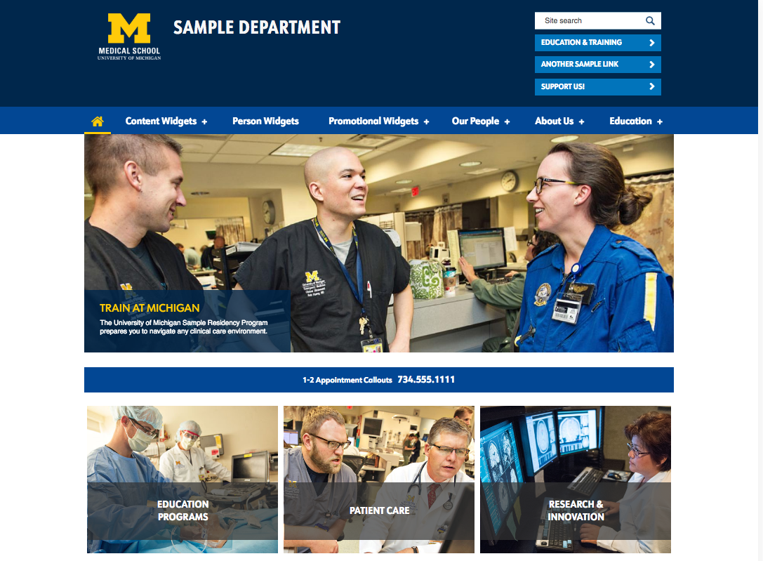
- An option for an alternate homepage treatment that swaps in a new image-driven billboard supported by call-to-action buttons instead of a rotating carousel. This alternate layout is available for use on sites that use the dark blue "department" theme.
- An option for adding site-specific header links under the search bar.
- An optional new image banner with text overlay and button at the bottom of the homepage.
- An option for adding image-driven square callouts with links and a hover effect to support homepage calls to action.
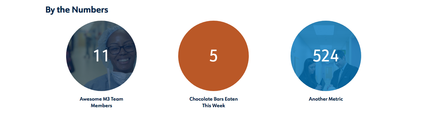
- A new content widget called Callout Circles, where you can highlight featured metrics or unit statistics.
- A new content widget called Pull Quote, where you can highlight a styled quote or blurb.
- A new content widget called Callout List, where you can list images and blurbs about unit services or areas of focus. This widget is for use on the alternate homepage layout only.
- A new content widget called Front Color Blocks, where you can promote images and blurbs in a colored background strip spanning the homepage. This widget is for use on the alternate homepage layout only.
We’ve also paid careful attention to web accessibility standards and have made improvements in color contrast, link styling, heading consistency, and keyboard focus.
What do I need to do?
You won’t need to migrate any content. When we “flip the switch” and launch the new look, your site will automatically take on the new theme.
However, we would like your help in reviewing your site content, pages, and images to ensure everything looks good.
For example, if you’ve added extra space to pages by hitting return, you may want to remove those spaces. We’re improving the readability of fonts by making them a bit larger and by adjusting spacing to increase the balance of white space and text on a page. You shouldn’t need to add extra space anymore to get that balance.
However, there is one important reason why you might want to make some bigger changes to your site in order to take advantage of a new feature: Top navigation.
If you’d like to convert from the regular left navigation menu to a top navigation menu, you’ll need to book an appointment to meet with us. Please submit a ticket via HITS to the attention of the Web Presence Team.
We’ll work with you to review your current site structure and figure out how best to translate it to top nav while reducing the risk of broken links resulting from changing page titles and URLs.
A few things you can be thinking about now, if you’re interested in top nav:
- Top navigation will have a 100-character limit for words in the navigation bar. This usually translates to about 5 to 8 top-level categories or “top tabs,” depending on the length of the words.
- Single-word page titles work best for the “top tab” items in top nav, to avoid text wrapping in an unattractive way.
- Dropdown menus for top nav will list the next-level child pages in each “top tab” section. Ideally, limiting the number of next-level child pages will reduce information overload when viewing them in a dropdown menu. A good number to shoot for is 5 to 8 next-level child pages per section. Third-level (and beyond) child pages will display in a side nav menu, rather than the dropdown, to provide the greatest flexibility for having a lot of content on a single website.
- Top nav is the only menu option available for use with the new alternate homepage layout. If you’re interested in the alternate homepage layout, you’ll need to be ready to convert to a top nav structure for your site.
We recommend not making any changes to your navigation yet. Reach out to set up an appointment, and we’ll walk you through the process.
Recap and next steps
To recap, here’s what you need to know about upcoming changes to the Drupal Department Platform:
- A new look-and-feel for your website is rolling out at the end of this summer. We’ll choose a launch date soon, so you know what to expect.
- If you’d like to use the new top navigation style, make an appointment with us to discuss your options. Please submit a ticket via HITS to the attention of the Web Presence Team.
- Check out our updated Sample site pages to see screenshots of the new look-and-feel.
- If you’d like a refresher on anything about the platform, contact us to set up a training session.
We’ll be communicating these changes to department CDAs and other leadership, as well.
If you have any questions or feedback, please get in touch by submitting a ticket to HITS to the attention of the Web Presence Team.
Thanks for all that you do, and carry on, content managers!