The alternate homepage layout features an additional full-width region for content widgets above the usual News / Events / Body Content region on the page.
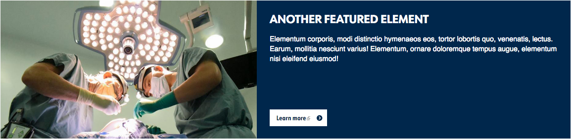
Front Color Blocks is designed for use in this top full-width region. It's ideal for pairing images and text on your choice of background colors from the U-M color palette to feature important calls to action or topics of interest to your site audience, such as "Meet our Researchers" or "Explore Training Opportunities."
The heading for Front Color Blocks works best when it starts with a verb, so let users know what to expect when they visit the promoted page.
The Front Color Blocks widget consists of:
- A label / heading
- Up to 200 characters of text
- An image measuring 1024x680
- A link styled as a button
- A background color from the U-M color palette
You can also add Front Color Blocks to the lower full-width content region of the homepage. In this lower full-width region, the block will not stretch edge-to-edge, but will have a margin on each end, to match the other content in that region.